Most websites don’t have a traffic problem – they have a conversion problem. Getting people through the door is just the first step. What really matters is what they do next. Are they signing up, booking a call, starting a trial, making it to checkout? That’s where conversion rate optimization (CRO) comes in. In this article, we’ll walk through clear, practical strategies that help you close that gap – no fluff, no guesswork, just tactics that actually move the needle.
What CRO Really Means in Practice
It’s tempting to think of CRO as a single tactic. Change one button and watch sales skyrocket. Unfortunately, real websites don’t behave that neatly. CRO is more of an ongoing cycle: notice what people are struggling with, test an improvement, measure the outcome, and keep going.
Conversion rate optimization rests on a few core truths. People rarely convert when the experience is confusing. Small friction points add up quickly. And data often reveals issues you didn’t see coming. That’s why clarity, simplicity, and honest observation matter more than assumptions.
Most businesses don’t have a conversion problem because their audience is uninterested. They have it because the experience is not as clear or helpful as it could be. CRO solves exactly that.
Our Role in Making CRO Actually Work
At Lengreo, we treat conversion optimization as a core part of every project – not just a metric we look at later. Whether we’re building campaigns, crafting content, or running outreach, we’re always focused on how those efforts translate into real action.
For us, CRO means spotting friction early, aligning messaging with how people actually buy, and making the entire journey easier to follow. From increasing MQL volume for SaaS teams to lifting conversion rates for tech clients, we’ve seen firsthand how the right strategy turns traffic into meaningful growth.
What Actually Moves the Needle: 12 CRO Strategies That Work
What follows isn’t a collection of trendy tips or theory-heavy tactics. These are practical, user-tested strategies based on what actually works across different industries, funnels, and visitor types. Some are quick fixes. Others take more digging. But every one of them is here because it addresses a real behavior that can make or break a conversion.
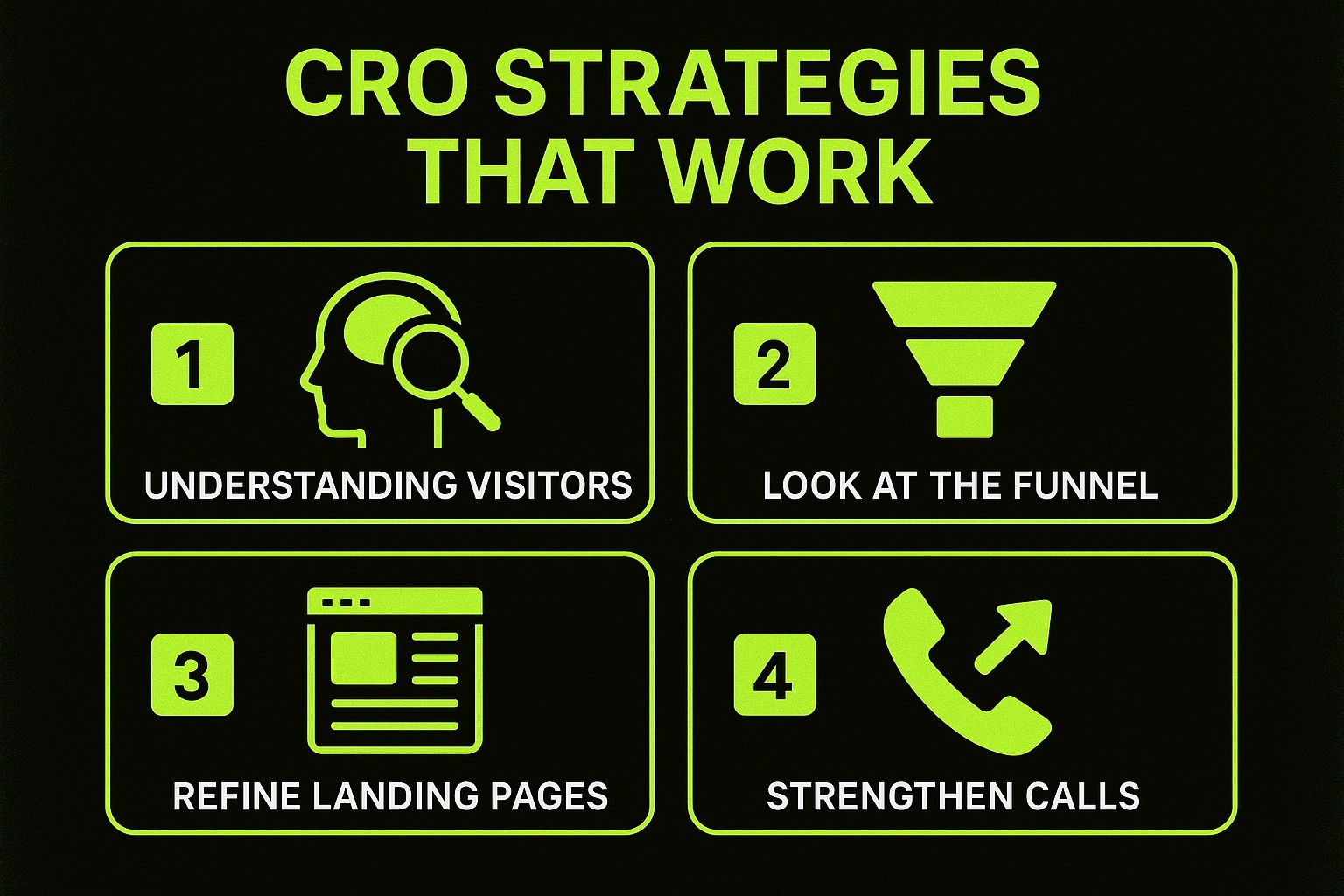
№1. Start With a Clear Understanding of Your Visitors
Before you touch any layout or headline, you need to understand who is actually landing on your pages. Website analytics are your first clue. They show where people come from, what they look at, and how long they stay. But numbers alone don’t tell the full story. That’s where more qualitative insights help.
You can learn a surprising amount by:
- Running short on-page surveys to understand what people expected when they arrived.
- Studying heatmaps to see where attention clusters and where it drops off.
- Watching session replays to observe hesitations, rage clicks, or moments where users seem unsure.
- Asking recent customers what almost stopped them from converting.
When you combine what people say with what they actually do, patterns start to emerge. Maybe your pricing page confuses new visitors. Maybe your landing page headline doesn’t match the ad that brought them in. Or maybe your mobile version feels cramped.
This early research helps you identify what needs fixing before you start experimenting.
№2. Look at Your Funnel With Fresh Eyes
Every website has a funnel, even if you never sat down to design one. It has a beginning, a few middle points, and a finish line. The goal of CRO is to keep people moving toward that finish line with as little resistance as possible.
Funnel analysis works best when you focus on drop-off points. Where do visitors exit most often? Where do they hesitate? These are not always the pages you expect.
For instance, many companies assume their homepage is the biggest problem. But funnel data often reveals that users fall off on pricing pages, long forms, or slow-loading product pages.
Once you identify the weak spots, you can prioritize which areas deserve attention first. In CRO, you don’t need to fix everything at once. You need to fix what makes the biggest difference.
№3. Refine Your Landing Pages to Match Visitor Intent
A landing page is the first impression and the moment in the journey where people decide if they trust you. The strongest landing pages don’t overwhelm the visitor. They reassure them that they’re in the right place and give them a clear next step.
If you want to improve your landing pages, keep these ideas in mind:
- Make the connection between the ad or search result and the page obvious. People should feel like they didn’t take a wrong turn.
- Focus each landing page on a single action. Multiple goals create confusion.
- Place the most important information near the top. People skim before they commit.
- Keep form fields to a minimum unless you truly need more information.
- Use visuals or short videos to make the value easier to grasp quickly.
Landing pages work best when they guide rather than demand. Give people context, clarity, and a simple path forward.
№4. Strengthen Your Calls to Action With Clearer Value
A call to action is not just a button. It is the promise behind the button. When the wording is too generic, people feel unsure. When it’s too vague, they skip it. A strong CTA speaks directly to what the user receives, not what they must do.
For example, “Submit” tells the user nothing. “Get your free report” is much clearer.
A good CTA uses clear, action-focused language, tells users what they’ll get, stands out visually, and appears where they’re most likely to act.
Many businesses also forget that CTAs can appear throughout the page, not just at the top or bottom. If someone reads halfway down and feels convinced, the opportunity should be right there, not three scrolls away.
№5. Fix the Small Frictions That Slow People Down
Some of the biggest CRO improvements come from small, almost invisible changes. Things like slow loading speed, confusing form labels, or broken mobile layout elements can quietly crush conversions.
A few practical areas to check:
- Page speed: Slow pages make visitors impatient, especially on mobile.
- Mobile layout: Buttons need room for fingers, not just cursors.
- Form complexity: Every field you add reduces the likelihood of completion.
- Navigation clarity: People should always know what the next step is.
Even a one-second delay can push people away. When a site loads fast, responds smoothly, and feels predictable, users are more likely to finish what they started.
№6. Personalize the Experience When It Makes Sense
Personalization is often seen as a luxury, but even simple personalization can make the user journey feel more relevant. You don’t need complicated systems to do this. A few thoughtful touches go a long way.
Personalization can take many forms. You might show different messages to returning visitors, adjust your homepage to better match what users are looking for, or tailor landing pages based on where someone came from. Even small touches, like suggesting products or content based on what someone just browsed, can make the experience feel more relevant.
Personalization works because it makes visitors feel understood. It removes the sense that they are navigating a generic website and replaces it with something closer to a tailored experience.
№7. Improve the Mobile Journey First, Not Last
Mobile traffic has overtaken desktop on most websites, yet many companies still design with desktop first in mind. CRO requires reversing that habit. If something feels awkward on a phone, the damage is already done.
To improve mobile conversions:
- Use larger buttons so users don’t mis-tap.
- Shorten text blocks to avoid endless scrolling.
- Keep forms simple and auto-fill friendly.
- Make sure images are compressed and loaded quickly.
- Test everything on actual devices, not just a browser emulator.
The mobile user is usually more distracted, more time-sensitive, and less forgiving. A smooth mobile experience often lifts conversions across the entire funnel.
№8. Give People Reasons to Trust You
Trust is one of the biggest factors in whether a visitor converts. People look for reassurance before they commit. When a website feels risky or anonymous, they hesitate. CRO benefits massively from showing proof that your business is reliable and real.
There are plenty of ways to build trust with your audience. Showing testimonials from well-known clients can go a long way, especially when paired with visible user ratings or reviews. Simple touches like security badges, clear contact information, and a real business presence help people feel more confident. And offering things like guarantees or refund policies can ease hesitation by lowering the risk for first-time buyers.
Think of trust elements as little nudges that make visitors feel safe moving forward. Without them, even the best offer feels unsure.
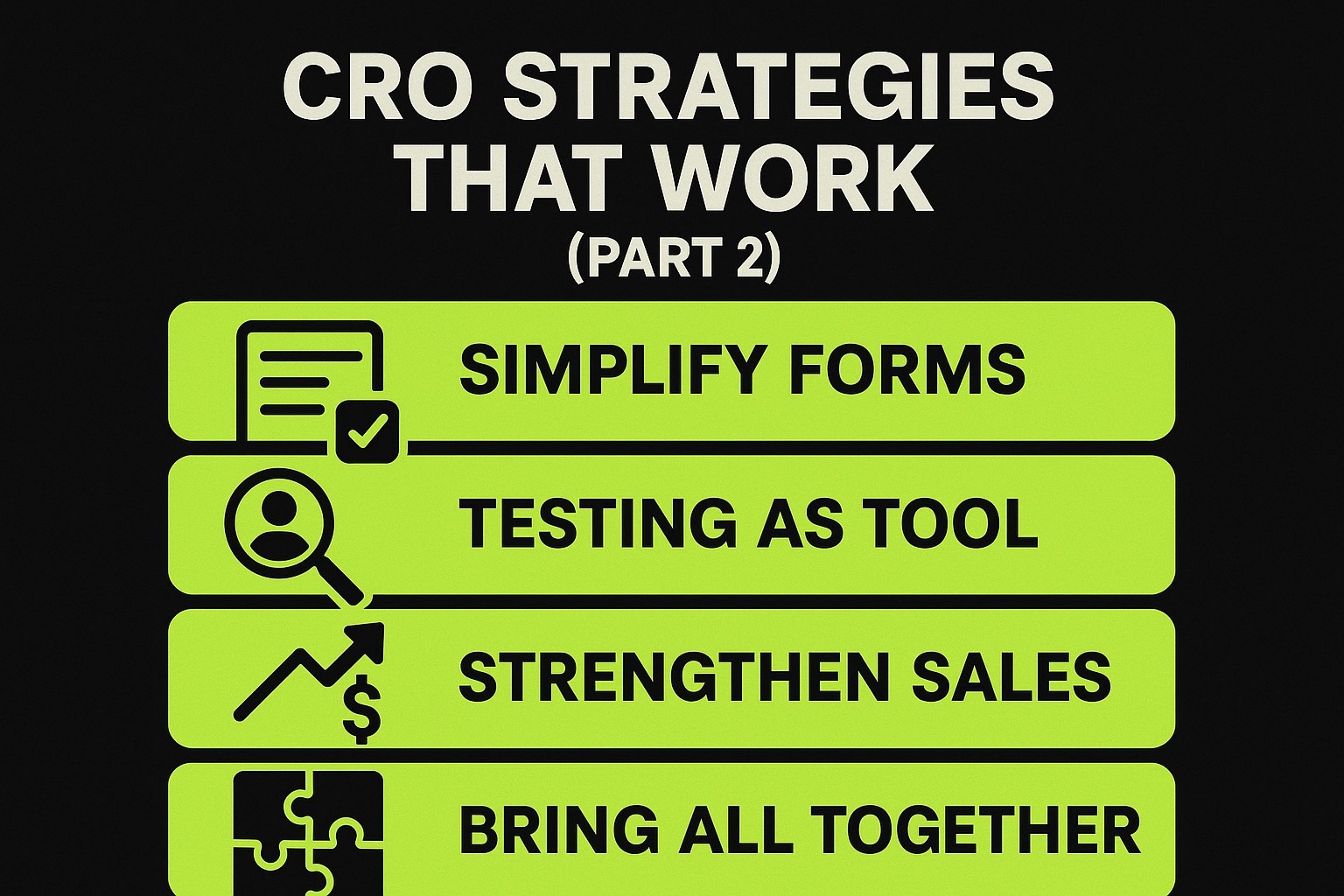
№9. Simplify Your Forms to Reduce Abandonment
Forms are often the biggest barrier between interest and action. People do not mind filling out a form if they believe the result is worth it. What they do mind is unnecessary effort.
To improve your form completion rates:
- Ask only for the essentials. Everything else can come later.
- Use single-column forms so the eye does not jump around.
- Provide real-time validation to prevent errors at the end.
- Break long forms into logical, short steps.
- Add context so users know why you need certain information.
If a form feels heavy or ambiguous, users back away. When it feels simple and transparent, they move through it naturally.
№10. Use Testing as a Tool, Not a Guessing Game
A/B testing can significantly improve your website, but only when used with a clear hypothesis. Testing random ideas for the sake of it wastes time and confuses your results.
A solid testing process starts with a clear hypothesis that explains why a specific change might improve conversions. To get accurate results, it’s important to test one variable at a time and let the experiment run long enough to collect meaningful data. Just as important is keeping track of what you tested and what happened, so you can learn from it and make smarter decisions down the line.
The goal is not to chase a magic headline. The goal is to learn from each experiment and gradually build knowledge about what your audience responds to.
№11. Strengthen Your Sales Funnel With Helpful Follow-Ups
Once people leave your site, the story isn’t over. Many conversions happen through follow-up touchpoints. Retargeting, email nurture sequences, and abandoned cart reminders give you a second chance with users who were interested but not ready.
You can set up effective follow-ups by:
- Sending helpful emails instead of pushy ones.
- Reminding users of items left in the cart.
- Showing personalized ads to people who viewed key pages.
- Sharing content that educates rather than pressures.
The right follow-up can turn a hesitant visitor into a confident buyer.
№12. Bring It All Together With Better User Experience
If you zoom out, you will notice that almost every CRO strategy is connected to one underlying theme: making the journey easier for the user. When your site feels intuitive, fast, trustworthy, and aligned with visitor intent, conversions naturally go up.
CRO is not about manipulating people into doing something they don’t want to do. It is about helping them reach the outcome they already came for, with fewer obstacles.
True CRO is practical, evidence-based, and rooted in good user experience.
Closing Insight: CRO Is a Long Game Built on Small Wins
It’s easy to look for one big fix when you’re trying to improve conversion rates. But the truth is, real progress comes from a steady stream of small, thoughtful changes. Each tweak teaches you something new. Each test helps you understand your visitors a bit better. Over time, those small wins add up.
The key is to stay curious. Let the data guide you, not just your gut. Pay attention to what users actually experience, even when the feedback stings. Focus on making the entire journey smoother, not just prettier. And most of all, think beyond the next quick win.
Conversion rate optimization works best when you treat your site like something that’s always evolving. Because when you do, even the same amount of traffic can start working a whole lot harder.