


Quick Summary: Website development for mobile devices involves creating sites optimized for smartphones and tablets through responsive design, mobile-first approaches, and touch-friendly interfaces. With over 60% of website traffic now coming from mobile devices, proper mobile optimization is essential for user engagement, SEO performance, and business success.
The internet isn’t what it used to be. Desktop computers no longer dominate how people access websites. According to recent data, over 60% of all website traffic now comes from mobile devices.
That shift changes everything. A website that looks perfect on a 27-inch monitor but breaks on a smartphone is essentially a broken website for most visitors. They’ll leave. They’ll find a competitor whose site actually works on their device.
Website development for mobile devices isn’t optional anymore. It’s the foundation of modern web design. This guide covers the strategies, techniques, and best practices that separate mobile-friendly sites from those that drive users away.
Why Mobile Website Development Matters
The numbers tell a clear story. According to the GSMA Intelligence, by the end of 2023, 5.6 billion people globally subscribed to mobile services, while the number of mobile internet users reached 4.7 billion. That’s more than half the planet accessing websites through phones and tablets.
But here’s the thing—simply having a website isn’t enough. Mobile users expect fast load times, intuitive navigation, and interfaces designed for touch interaction. When those expectations aren’t met, bounce rates spike.
Search engines know this. Google’s algorithms prioritize mobile-friendly sites in search results. A site that doesn’t perform well on mobile devices gets pushed down in rankings, regardless of how good the content might be.
Mobile development also affects conversion rates. Users abandon purchases, sign-ups, and contact forms when the experience is frustrating. Small buttons, slow loading, or text that requires zooming—each issue costs potential customers.
Create a Mobile Website People Will Use
Most visitors now come from phones first, which means slow pages, confusing navigation, and difficult forms can quietly hurt conversions long before someone contacts your business. Lengreo develops websites built around usability, performance, and long-term maintainability instead of overloaded designs that become difficult to manage later. Their workflow includes business analysis, prototyping, front-end and back-end development, QA, and launch support, helping businesses create websites that work properly across mobile devices and different screen sizes.
Keep Visitors Engaged Long-Term
With Lengreo, you can expect:
- Mobile-friendly website structure and navigation
- Front-end development focused on usability and speed
- QA testing before launch across devices
👉Contact Lengreo and get a consultation for your mobile website project.
Mobile-First vs. Responsive Design Approaches
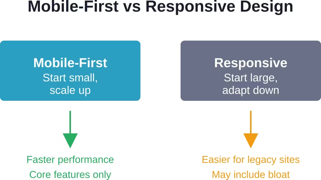
Two core philosophies dominate mobile website development: mobile-first design and responsive design. Both aim to create sites that work across devices, but they take different paths to get there.
Responsive Design
Responsive design starts with the desktop version and adapts down to smaller screens. CSS media queries adjust layouts, images, and content based on screen size. Elements stack vertically on mobile, and navigation menus collapse into hamburger icons.
This approach works well for existing sites that need mobile optimization. It’s less disruptive to implement since the desktop version remains the primary focus.
However, responsive design can lead to bloated mobile experiences. Features designed for desktop might not translate well to smaller screens but still load in the background, slowing performance.
Mobile-First Design
Mobile-first design flips the script. Development begins with the smallest screen size and scales up. The mobile experience defines the core functionality, and desktop versions add enhancements.
This philosophy forces prioritization. What features are truly essential? What content matters most? Those decisions shape the entire site architecture.
Mobile-first development typically results in faster load times and cleaner interfaces. Since the baseline version is optimized for limited bandwidth and smaller screens, performance is baked in from the start.
Essential Features of Mobile Website Development
Certain features separate functional mobile sites from exceptional ones. These elements form the foundation of effective mobile development.
Touch-Optimized Interface Elements
Fingers aren’t mouse cursors. They’re larger, less precise, and interact with screens differently. Buttons need sufficient size—minimum 44×44 pixels for tap targets. Spacing between interactive elements prevents accidental clicks.
Swipe gestures for image galleries, pull-to-refresh for content updates, and tap-to-expand for menus all feel natural on mobile devices. These interactions should be intuitive, not requiring instructions or tutorials.
Fast Load Times
Mobile connections are often slower than desktop broadband. Pages must load quickly even on 4G networks. Image optimization, lazy loading, and minimal JavaScript all contribute to speed.
Every second of delay increases bounce rates. Sites with slow load times experience higher bounce rates and reduced user engagement.
Simplified Navigation
Complex mega-menus don’t work on small screens. Mobile navigation needs to be straightforward—typically a hamburger menu or bottom navigation bar with clear labels.
The goal is getting users to their destination in as few taps as possible. Deep menu hierarchies frustrate mobile visitors who just want to find information quickly.
Readable Typography
Text must be legible without zooming. Base font sizes should be at least 16 pixels. Line height and letter spacing need adjustment for smaller screens.
Contrast matters too. Light gray text on white backgrounds might look elegant on a desktop but becomes unreadable in bright sunlight on a mobile screen.
Forms Optimized for Mobile Input
Filling out forms on mobile devices is tedious. Smart development minimizes the pain. Input fields should trigger appropriate keyboards—numeric for phone numbers, email-specific for addresses.
Autofill support, clear labels, and prominent error messages reduce friction. Multi-step forms often work better than long single-page versions on mobile.
Mobile Development Best Practices
Beyond core features, several best practices elevate mobile website development from adequate to outstanding.
Test on Real Devices
Desktop browser simulators don’t capture the full mobile experience. Touch interactions, actual load times on cellular networks, and how content renders on different screen sizes all vary from simulations.
Testing across multiple devices—different iPhone models, Android phones, tablets—reveals issues that desktop testing misses. Real-world usage uncovers problems that theoretical testing overlooks.
Optimize Images and Media
Large image files kill mobile performance. Responsive images that serve appropriately sized versions for different screens save bandwidth and improve load times.
Modern image formats like WebP offer better compression. Videos should be lazy-loaded and include mobile-friendly controls. Autoplay videos drain battery and data plans, so they should be avoided.
Minimize Pop-Ups and Interstitials
Pop-ups are annoying on the desktop. On mobile, they’re deal-breakers. Full-screen overlays that are difficult to close drive users away immediately.
If promotional messages are necessary, use subtle banners or timed notifications that don’t interrupt the browsing experience. Google’s algorithms penalize sites with intrusive interstitials on mobile.
Implement Progressive Web App Features
Progressive Web Apps (PWAs) blur the line between websites and native apps. Features like offline functionality, push notifications, and home screen installation enhance the mobile experience.
Service workers cache content for offline access. App manifests enable installation prompts. These features provide app-like experiences without requiring app store downloads.
Prioritize Content Hierarchy
Screen real estate is limited. The most important content must appear first. Users shouldn’t need to scroll through promotional banners and navigation to reach the actual information they’re seeking.
Clear visual hierarchy guides attention. Important elements use size, color, and position to stand out. Secondary content gets pushed lower or hidden behind expandable sections.
Technical Implementation Strategies
The actual development process involves specific technical decisions that affect how sites perform on mobile devices.
Viewport Configuration
The viewport meta tag tells mobile browsers how to render the page. Without proper configuration, sites display as miniature desktop versions that require pinching and zooming.
The standard viewport setting ensures the page width matches the device width and sets initial zoom to 100%. This single line of code is fundamental to mobile rendering.
Flexible Grid Layouts
Fixed-width layouts break on different screen sizes. Flexible grids use relative units (percentages, ems, rems) instead of fixed pixels. Content reflows naturally as screen dimensions change.
CSS Grid and Flexbox provide powerful tools for creating layouts that adapt automatically. These modern CSS features handle complex responsive designs without requiring extensive media queries.
Media Queries for Breakpoints
Breakpoints define where layouts change to accommodate different screen sizes. Common breakpoints target phones (up to 767px), tablets (768px to 1023px), and desktops (1024px and above).
But here’s the thing—breakpoints should be based on content, not specific devices. When content becomes awkward at a certain width, that’s where a breakpoint belongs.
Mobile-Specific Performance Optimization
Techniques like code splitting, tree shaking, and critical CSS extraction reduce the amount of code mobile devices need to download. Service workers enable caching strategies that improve repeat visit performance.
Content Delivery Networks (CDNs) serve assets from geographically closer servers, reducing latency. HTTP/2 and HTTP/3 protocols improve loading efficiency through multiplexing and better compression.
| Optimization Technique | Impact on Mobile | Implementation Difficulty |
|---|---|---|
| Image compression | Significant load time reduction | Low |
| Lazy loading | Faster initial page load | Low |
| Code splitting | Reduced JavaScript bundle size | Medium |
| Service workers | Offline functionality, faster repeats | High |
| Critical CSS | Faster first contentful paint | Medium |
| CDN implementation | Lower latency worldwide | Low to Medium |
Common Mobile Development Mistakes
Even experienced developers make mistakes that hurt mobile performance. Awareness prevents these common pitfalls.
Ignoring Touch Target Sizes
Small buttons and links frustrate mobile users. Apple recommends 44×44 points for tap targets. Google suggests 48×48 density-independent pixels. Both guidelines exist for good reason—smaller targets lead to mis-taps and user frustration.
Using Hover-Dependent Interactions
Hover states don’t exist on touch screens. Navigation that relies on hovering over elements to reveal submenus simply doesn’t work. All interactive elements need to be accessible through taps.
Blocking Content with Fixed Headers
Fixed headers that stay visible while scrolling can occupy 20-30% of mobile screen space. That’s a significant portion of already limited real estate. Either make headers disappear on scroll or keep them minimal.
Loading Desktop Assets on Mobile
Serving full-resolution images meant for 27-inch monitors to smartphones wastes bandwidth and slows loading. Responsive images with srcset attributes deliver appropriately sized versions based on device capabilities.
Neglecting Landscape Orientation
Most mobile development focuses on portrait orientation, but users rotate their devices. Sites should handle both orientations gracefully, adjusting layouts as needed.
Tools and Frameworks for Mobile Development
The right tools streamline mobile website development and ensure consistent quality.
Development Frameworks
Bootstrap, Foundation, and Tailwind CSS provide responsive grid systems and pre-built components optimized for mobile devices. These frameworks handle much of the heavy lifting for responsive design.
React, Vue, and Angular offer component-based architectures that work well for mobile-focused single-page applications. These frameworks enable building complex interactive experiences that perform well on mobile.
Testing Tools
Chrome DevTools includes device emulation for testing different screen sizes and network conditions. Real device testing remains essential, but emulation catches many issues during development.
BrowserStack and Sauce Labs provide cloud-based testing across numerous real devices without requiring physical hardware. These services enable comprehensive device testing at scale.
Performance Analysis
Google Lighthouse audits sites for mobile performance, accessibility, and SEO. It provides specific recommendations for improvement with measurable metrics.
WebPageTest offers detailed waterfall charts showing exactly how pages load on mobile connections. This visibility helps identify bottlenecks.
Design Tools
Figma, Sketch, and Adobe XD all include mobile device templates and responsive design features. These tools enable designing and prototyping mobile experiences before writing code.
Many include interactive prototyping that simulates touch interactions and transitions, allowing designers to test mobile UX concepts early in the process.
Future Trends in Mobile Web Development
Mobile development continues evolving. Several emerging trends will shape how sites are built for mobile devices in coming years.
Foldable and Flexible Screens
Devices with foldable screens create new design challenges. Sites need to handle transitions between folded and unfolded states smoothly. Screen continuity APIs help developers detect and respond to these changes.
5G Network Capabilities
Faster mobile networks enable richer experiences. Higher bandwidth allows for more complex interactions, higher-quality media, and real-time features that were previously impractical on mobile.
But here’s the catch—not everyone has 5G access yet. Sites still need to perform well on slower connections while taking advantage of faster speeds when available.
WebAssembly for Mobile Performance
WebAssembly enables near-native performance for complex applications in browsers. This technology allows computationally intensive tasks to run efficiently on mobile devices without requiring app installation.
Advanced PWA Features
Progressive Web Apps continue gaining capabilities. Background sync, periodic background sync, and Web NFC enable experiences previously only possible in native apps.
The line between web and native apps continues blurring, giving mobile websites access to device features that were once exclusive to app stores.
Measuring Mobile Website Success
Development doesn’t end at launch. Measuring performance helps identify what works and what needs improvement.
Key Metrics to Track
Core Web Vitals—Largest Contentful Paint, First Input Delay, and Cumulative Layout Shift—measure user experience quality. These metrics directly affect search rankings and user satisfaction.
Mobile-specific analytics reveal how users interact with sites on different devices. Bounce rates, time on page, and conversion rates often differ significantly between mobile and desktop.
User Testing and Feedback
Analytics show what happens but not why. User testing reveals pain points that metrics don’t capture. Watching real users navigate a mobile site exposes usability issues that developers miss.
Heatmaps and session recordings show where users tap, how far they scroll, and where they get stuck. This behavioral data informs optimization priorities.
| Metric | Good Target | What It Measures |
|---|---|---|
| Largest Contentful Paint | < 2.5 seconds | Loading performance |
| First Input Delay | < 100 milliseconds | Interactivity |
| Cumulative Layout Shift | < 0.1 | Visual stability |
| Mobile bounce rate | < 50% | Initial engagement |
| Mobile conversion rate | Varies by industry | Goal completion |
Conclusion
Website development for mobile devices isn’t a checkbox on a project plan. It’s a fundamental shift in how sites are conceived, designed, and built.
With over 60% of web traffic coming from mobile devices, optimization isn’t optional. Sites that ignore mobile users lose traffic, rankings, and revenue. Those that prioritize mobile experience gain competitive advantages that compound over time.
The strategies covered here—mobile-first thinking, touch-optimized interfaces, performance optimization, and continuous testing—form the foundation of successful mobile development. But technology evolves. New devices, network capabilities, and user expectations will continue changing what “mobile-friendly” means.
The constant? Users expect websites to work flawlessly on whatever device they’re using. Meeting that expectation requires ongoing attention, testing, and refinement. Start with solid fundamentals, measure real user experience, and iterate based on data.
Ready to optimize your site for mobile devices? Begin with a mobile audit of your current site, identify the biggest performance and usability gaps, and prioritize fixes that will have the greatest impact on user experience. The mobile web isn’t the future—it’s the present.