

Quick Summary: Building an effective website for student audiences requires mobile-first design, intuitive navigation, fast load times, and accessible content. Research shows 94% of people reject websites based on poor design, while 91% of prospective students rely on college websites for information. Success hinges on understanding student behavior, prioritizing user experience, and creating content that addresses their specific needs throughout their educational journey.
Students have zero patience for clunky websites. They’re navigating academic decisions on phones between classes, comparing programs during late-night study sessions, and expecting instant answers to complex questions.
The stakes? According to research by Elizabeth Sillence and colleagues, 94% of feedback related to distrust of a website was design-related. When institutions and organizations build digital experiences for students, every design choice matters.
Here’s the thing though—most education websites still treat students like passive information consumers. Modern students are active users who bounce within seconds if they can’t find what they need. Building an effective student-focused website demands understanding how this audience behaves, what they expect, and why traditional approaches fall short.
Understanding Your Student Audience
Before diving into design specifics, recognize that student audiences aren’t monolithic. Prospective students have different needs than admitted students. Current students need quick access to resources while alumni want connection opportunities.
Research from the National Center for Education Statistics highlights that digital access shapes student expectations. In 2024, the Federal Communications Commission (FCC) increased the benchmark for fixed broadband to 100 Mbps for downloads and 20 Mbps for uploads.
Gen Z users—the current student demographic—spend an average of 7 hours and 22 minutes daily on their phones. That’s not a preference. It’s their primary computing device. About 75% say their phone is their go-to device for everything, including researching educational opportunities.
Behavioral Patterns That Matter
Students interact with websites differently than other demographics. They scan rather than read. They expect mobile-first experiences. And they’ll abandon a site that doesn’t deliver answers within seconds.
According to available data, 91% of prospective students use college websites to learn about schools. But here’s where it gets frustrating: one in four students finds it hard to get information about specific majors or programs. Another 67% leave because they can’t quickly locate the information they need.
This disconnect between student behavior and website design creates massive opportunities for institutions that get it right.
Develop a Website That Keeps Students Engaged
If pages feel outdated, difficult to navigate, or frustrating on mobile devices, attention disappears fast. A strong student-focused website needs to feel clear, organized, and easy to use from the first visit. Lengreo works with organizations that want more than a quick website launch. Their team stays involved throughout the entire development process, helping clients move from early planning and design to launch and post-release support without handling every technical detail internally.
Let a Proven Partner Handle Your Website
With Lengreo, you receive:
- Discovery-stage support focused on goals, audience needs, and online presence
- Development-stage refinements to fine-tune website details and usability
- Post-launch support with domain setup or migration assistance
Contact Lengreo if you want a student-focused website backed by a team that stays involved long after the build is finished.
Mobile-First Design Is Non-Negotiable
Look, desktop optimization still matters. But mobile-first design isn’t optional anymore—it’s the baseline expectation.
Students check your website between classes on phones with spotty campus WiFi. They compare programs on tablets during commutes. They bookmark resources on whatever device is closest. The experience needs to work flawlessly across all of them.
What Mobile-First Actually Means
Mobile-first doesn’t just mean responsive. It means designing the entire experience for small screens first, then scaling up. Navigation that works on desktop often becomes unusable on mobile. Content hierarchies that make sense on large monitors get lost on phones.
Start with these principles:
- Touch targets at least 44×44 pixels for easy tapping
- Single-column layouts that eliminate horizontal scrolling
- Compressed images optimized for cellular networks
- Forms simplified to minimize typing on small keyboards
- Key information above the fold on mobile screens
Speed becomes even more critical on mobile. Students won’t wait three seconds for a page to load. They’ll hit back and check out your competitor instead.
Navigation That Students Actually Understand
Here’s where most education websites fail spectacularly. They organize information by internal department structure rather than student mental models.
Students don’t think in terms of “Office of the Registrar” or “Division of Academic Affairs.” They think about tasks: “How do I register for classes?” “What majors can I choose?” “Where do I find financial aid?”
Research in user experience design, documented by the Nielsen Norman Group, shows that usability testing reveals these disconnects. Students consistently struggle with navigation structured around institutional hierarchy rather than user goals.
Navigation Best Practices
Create navigation that mirrors how students think. Use task-based labels. Group related information by user journey, not by department.
Consider these approaches:
- Audience-based navigation (Prospective, Current, Alumni)
- Task-based menus (Apply, Register, Pay, Learn)
- Prominent search functionality with smart suggestions
- Breadcrumbs showing current location in site hierarchy
- Quick links to the most-accessed pages
The Paradox of the Active User, one of the key UX laws highlighted in user experience research, explains why navigation clarity matters. Students don’t want to learn your website’s structure. They want to complete tasks immediately.
| Navigation Approach | Student Experience | Effectiveness |
|---|---|---|
| Department-Based | Confusing, requires institutional knowledge | Low |
| Audience-Based | Clear segmentation, reduces irrelevant content | High |
| Task-Based | Intuitive, matches user mental models | Very High |
| Hybrid Approach | Flexible, accommodates multiple paths | High |
Content Strategy for Student Engagement
Students scan content. They don’t read every word. The way information is presented determines whether they stay or bounce.
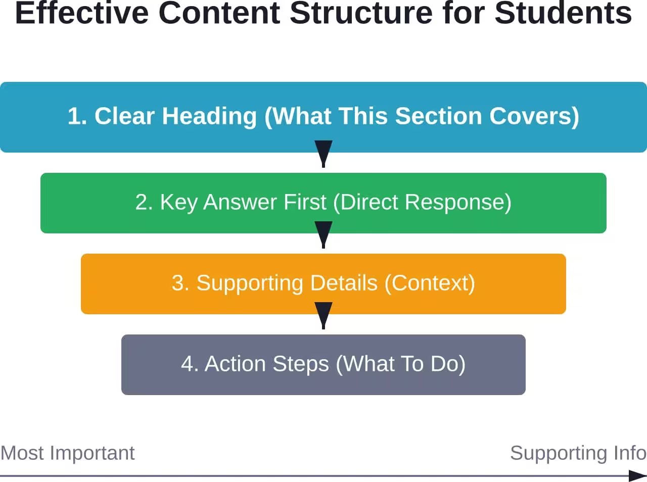
Write in clear, direct language. Avoid institutional jargon. Break up dense paragraphs. Use headings that actually describe the content below them.
Content Hierarchy Matters
Put the most important information first. Answer the question in the first sentence, then provide supporting details. Students often read only the first paragraph before deciding whether to continue.
The Pareto Principle applies directly to content strategy. Research from Georgia Southern University’s case study on UX design found that 80% of user needs can be met by 20% of content—if that content is properly prioritized and discoverable.
Structure content with:
- Descriptive headings that preview the section
- Short paragraphs (2-3 sentences maximum)
- Bullet points for scannable lists
- Bold text to highlight key information
- White space to reduce cognitive load
Real talk: if students can’t scan your page and extract key information in 10 seconds, they’re gone.
Accessibility Standards Cannot Be Ignored
Accessibility isn’t just good ethics—it’s often legally required. And it makes websites better for everyone, not just users with disabilities.
Students with visual impairments use screen readers. Students with motor disabilities navigate via keyboard. Students with cognitive differences benefit from clear, consistent layouts. Building accessible websites serves the entire student population.
Essential Accessibility Features
Start with these foundational accessibility practices:
- Proper heading hierarchy (H1, H2, H3 in order)
- Alt text for all images describing content and context
- Sufficient color contrast (4.5:1 minimum for body text)
- Keyboard navigation for all interactive elements
- Form labels properly associated with inputs
- Video captions and transcripts
- Skip navigation links for screen readers
Digital infrastructure investment, such as broadband expansion programs, highlights how connectivity shapes educational equity. Websites must be accessible to everyone who reaches them.
Performance Optimization for Student Retention
Speed kills. Or rather, lack of speed kills conversion rates.
Students expect pages to load in under two seconds. Every additional second of load time increases bounce rates. When prospective students are comparing multiple institutions, the fastest website often wins by default.
Technical Performance Priorities
Optimize for speed with these technical improvements:
- Compress and properly size all images
- Minimize HTTP requests
- Enable browser caching
- Use content delivery networks (CDNs)
- Minify CSS and JavaScript files
- Implement lazy loading for images below the fold
Testing matters. Use tools to measure actual load times on various devices and connection speeds. Don’t assume campus WiFi represents how students access your site.
| Performance Factor | Target Metric | Impact on Student Experience |
|---|---|---|
| Page Load Time | < 2 seconds | Critical for retention |
| Time to Interactive | < 3 seconds | Enables user engagement |
| Image Optimization | 80%+ compression | Faster mobile loading |
| Mobile Performance Score | 90+ (out of 100) | Search ranking factor |
Personalization and User Experience
Students expect websites to adapt to their needs. Personalization doesn’t require complex AI—it starts with understanding where students are in their journey.
Prospective students need admissions information. Admitted students need enrollment guidance. Current students need quick access to portals and resources. The homepage should adapt based on the user segment when possible.
Smart Personalization Approaches
Implement personalization through:
- Audience-specific landing pages
- Cookie-based return visitor recognition
- Location-based content (for regional campuses)
- Program-specific pathways after initial selection
- Saved preferences in user accounts
Research from Oregon State University on learning environments emphasizes minimizing extraneous cognitive load. Personalization achieves this by showing students only the information relevant to their current needs.
Search Functionality That Works
Students use search more than browsing. When navigation fails them, they type queries into the search box. If search also fails, they leave.
But wait—most education website search functions are terrible. They return hundreds of irrelevant results. They can’t handle common misspellings. They prioritize outdated content over current pages.
Building Better Search
Improve search with these strategies:
- Implement smart autocomplete suggestions
- Show filtered results by content type
- Use synonyms and common misspellings
- Weight recent content higher in results
- Provide “Did you mean…” corrections
- Track failed searches to identify content gaps
Analytics on search queries reveal exactly what students can’t find through navigation. This data becomes a roadmap for information architecture improvements.
Content Management and Maintenance
Launching a great website is step one. Keeping it great requires ongoing effort.
Education websites decay quickly without maintenance. Links break. Content becomes outdated. New programs launch without corresponding website updates. Students notice these problems immediately and question institutional competence.
Sustainable Maintenance Strategies
Build maintenance into regular workflows:
- Schedule quarterly content audits
- Assign clear ownership for each section
- Implement content expiration dates
- Monitor broken links automatically
- Review analytics monthly to identify problems
- Update admissions timelines annually
Community discussions on academic websites often center on maintenance challenges. The consensus: websites need dedicated resources, not just initial budgets. Plan for ongoing content updates, not just launch expenses.
Testing with Real Students
Assumptions about what students want often miss the mark. Testing with actual users reveals unexpected problems and validates solutions.
According to usability testing research, testing with a small number of users uncovers a majority of usability problems. Testing doesn’t require massive budgets—it requires commitment to learning from actual student experiences.
Effective Testing Approaches
Conduct usability testing through:
- Task-based testing with current students
- First-click tests on key pages
- Card sorting to validate navigation structure
- A/B testing on high-traffic pages
- Heat mapping to understand interaction patterns
Eye-tracking research from Loyola University Chicago demonstrates that website design dramatically influences where users look and what they trust. Testing reveals these patterns and guides improvements.
Measuring Success and Iteration
Launching the website isn’t the finish line. Continuous improvement based on data separates good websites from great ones.
Track metrics that matter to student outcomes, not vanity metrics. Page views don’t indicate success if students can’t complete tasks. Time on site isn’t positive if it reflects confusion rather than engagement.
Key Performance Indicators
Monitor these student-focused metrics:
- Task completion rates for key user flows
- Search success rate (finding results vs. abandoning search)
- Mobile vs. desktop conversion rates
- Pages per session for prospective students
- Form abandonment rates
- Top exit pages (indicating problems or completion)
Analytics identify problems. Iteration fixes them. The cycle never stops because student expectations continue evolving.
| Metric | What It Reveals | Action Threshold |
|---|---|---|
| Bounce Rate | Landing page effectiveness | > 60% requires attention |
| Search Exit Rate | Search quality problems | > 40% indicates poor results |
| Mobile Conversion | Mobile experience gaps | < 50% of desktop needs work |
| Form Completion | Form usability issues | < 70% suggests simplification needed |
| Page Load Time | Performance problems | > 3 seconds loses users |
Building Websites Students Actually Use
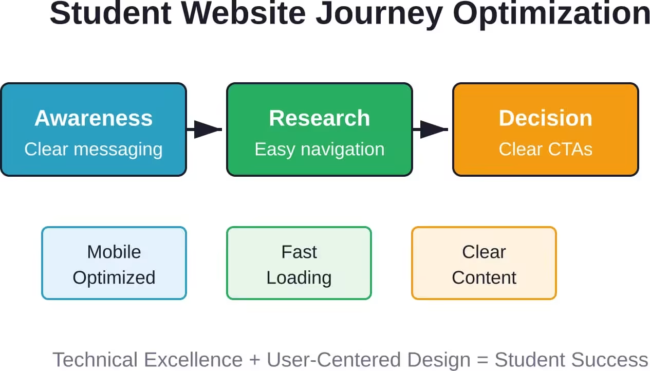
The difference between websites students tolerate and websites students love comes down to understanding that students are active users, not passive information consumers. They have specific goals, limited patience, and high expectations shaped by the best consumer websites they use daily.
Start with mobile-first design because that’s where students live. Build navigation around student tasks, not institutional structure. Write scannable content that answers questions immediately. Optimize relentlessly for speed because every second of load time costs conversions.
But here’s the thing—building an effective student website isn’t a one-time project. It’s an ongoing commitment to testing, measuring, learning from actual student behavior, and iterating based on data. The institutions that embrace this continuous improvement mindset create digital experiences that support student success from first research through alumni engagement.
Ready to transform your student-facing digital presence? Start by testing your current website with five students completing real tasks. The gaps between what works and what frustrates them will guide your first improvements. Every enhancement that removes friction and helps students accomplish their goals builds toward a website that genuinely serves its audience.